
Interval ADP Update: Data Shows Recent Population Numbers Inside ICE Detention Centers
Get the data and 164 graphs to see the recent detained population at every ICE detention facility in the country.


Stewart Detention Center in rural Georgia is one of the largest of ICE’s immigrant detention centers in the country—but getting accurate, up-to-date numbers of how many people are held inside is difficult.
ICE’s most recent detention spreadsheet reports that the average population since October 1, 2024 (the start of the fiscal year) is 1,828. But according to our calculations using Interval ADP, the most recent numbers are much higher at 2,238—a gap of more than 400. This means that Stewart has been well over its capacity of 1,752 detainees since February. These numbers may have increased since June 9, the date of the most recent data—especially since ICE was set to make record numbers of arrests in June.

Identifying accurate populations at ICE detention facilities is more important than ever as detention space and services remains unable to keep up with ICE’s massive expansion of immigration enforcement across the country. For instance, at least two migrants have died inside Stewart Detention Center recently (one on May 8 and one on June 7) and a third died in transit in the region, adding to what Andrew Free calls an “8-Year Death Spiral.”
To learn more about how the profit motive behind the U.S. immigrant detention system contributes to migrant deaths in detention, listen to my conversation with Nancy Hiemstra and Deirdre Conlon about their new book, “Immigration Detention, Inc.”

In this post, we update our previous analyses of ICE’s detention data using the Interval ADP method. Interval ADP is a new method for estimating recent population levels at ICE detention facilities by measuring the change in ICE’s reported averages between two specific dates—usually over a two-week period. Unlike ICE’s fiscal-year-to-date average, which smooths out short-term spikes, Interval ADP captures real-time fluctuations and provides a clearer picture of sudden increases or decreases in detention. Read more about Interval ADP in our previous Substack posts—New Method Uncovers Hidden Population Spikes at Some ICE Detention Centers and A First Look at ICE's Detained Population at Individual Facilities—or read the methods paper online.
These numbers matter because spikes in immigration enforcement across the country often lead to increases in arrests and subsequent detention. While some individuals are detained near the location of their arrest, many are transferred to detention centers located far from where the enforcement action took place. As a result, regional spikes in detention populations should not be automatically interpreted as local increases in enforcement activity. At the same time, we do not rule out that possibility, either. Our aim is to offer both the data and a clear methodology to help illuminate what is happening inside immigration detention facilities. We encourage the public—including journalists, researchers, and policymakers—to interpret these data in relation to on-the-ground reports.
As I previously wrote, ICE’s detained population may be at record highs with at least 56,397 people in detention. But this growing detained population doesn’t mean that detained populations are up everywhere, or up everywhere by the same amount. Using Interval ADP, we examine several facilities with interesting or unexpected trends in recent weeks and months to illustrate why this method can be so important. At the end, we provide Interval ADP graphs for all facilities currently in use as well as an interactive table of facility-level populations.
Cibola County Correctional Center in New Mexico shows an interesting trend: despite an overall increase in detention numbers over the past several weeks, Cibola peaked back in April and has been declining since then. Coincidentally, Interval ADP and ICE’s Reported ADP are equivalent now, but they diverged widely for several months.

Like Cibola, the ICE facility in Torrance, New Mexico, saw a previous spike followed by a decline for the past three reporting periods.

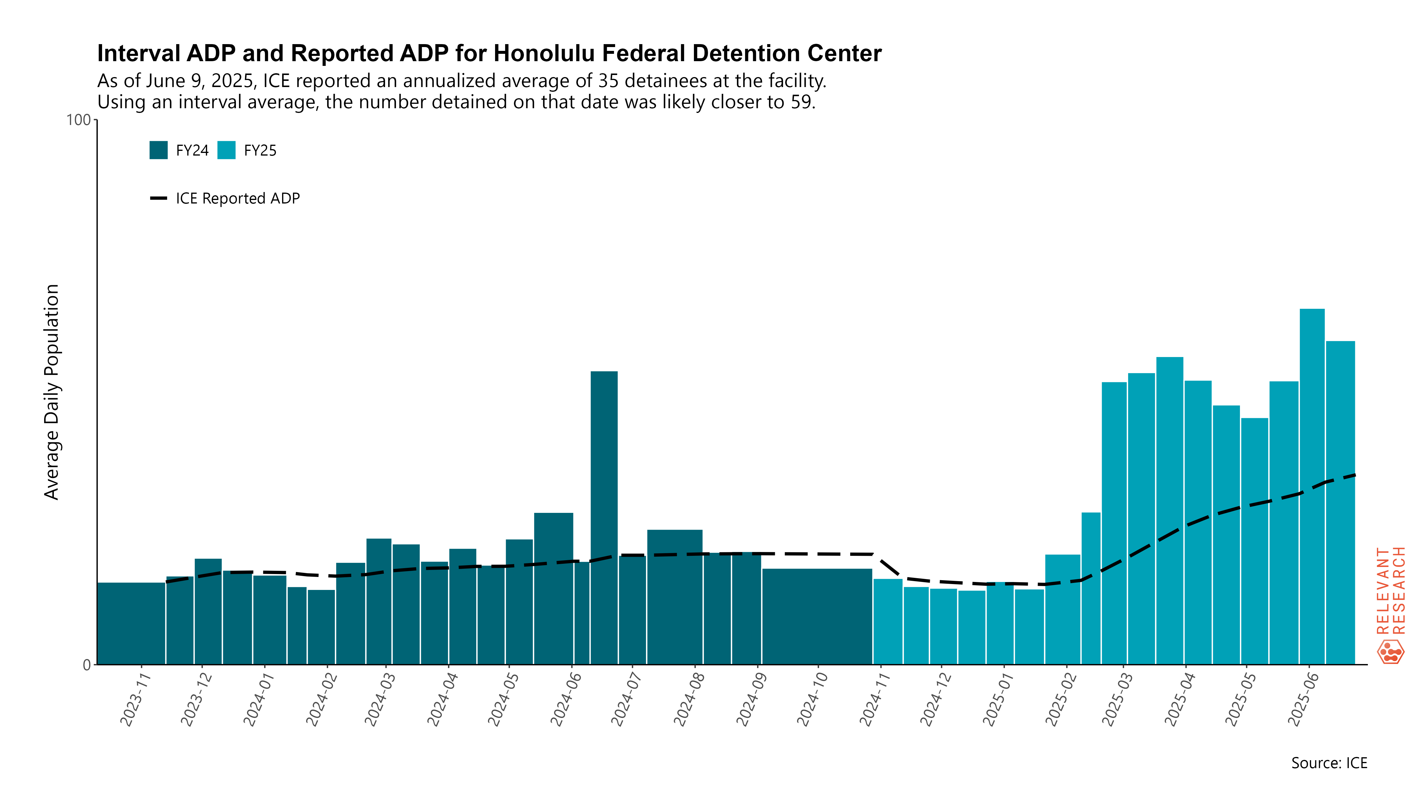
By contrast, Honolulu’s remote detention facility has seen a substantial increase in detained population since late February—a result of stepped-up ICE arrests on the colonial state of Hawai‘i.
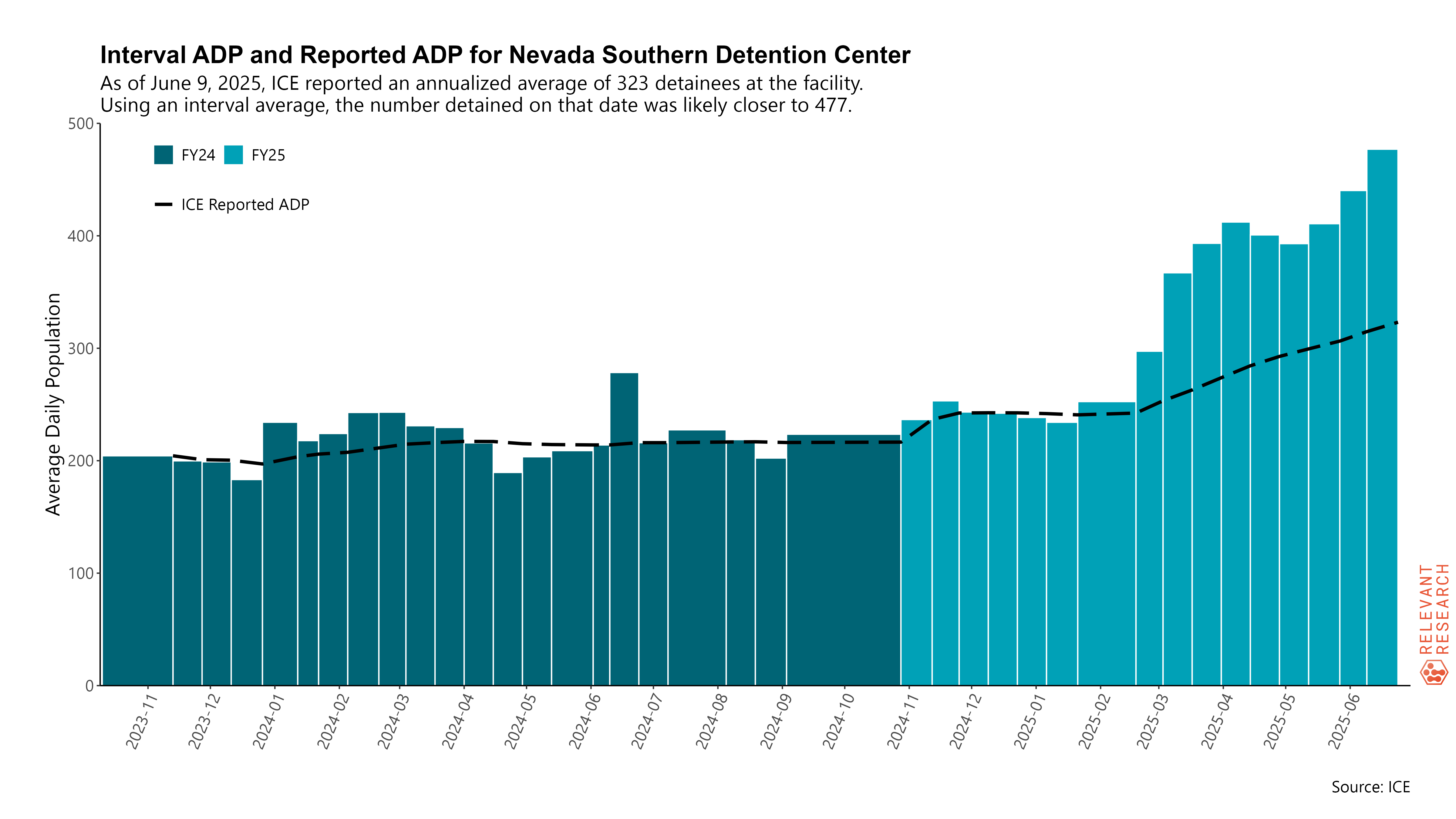
Nevada Southern is at a recent peak right now, with an Interval ADP well above what ICE has reported in its data. Notice that in the middle of February, while other facilities reported their data, Nevada Southern did not—resulting in an Interval ADP measurement that is wider than other facilities. When this happens, our method calculates a longer interval (i.e., wider bar).
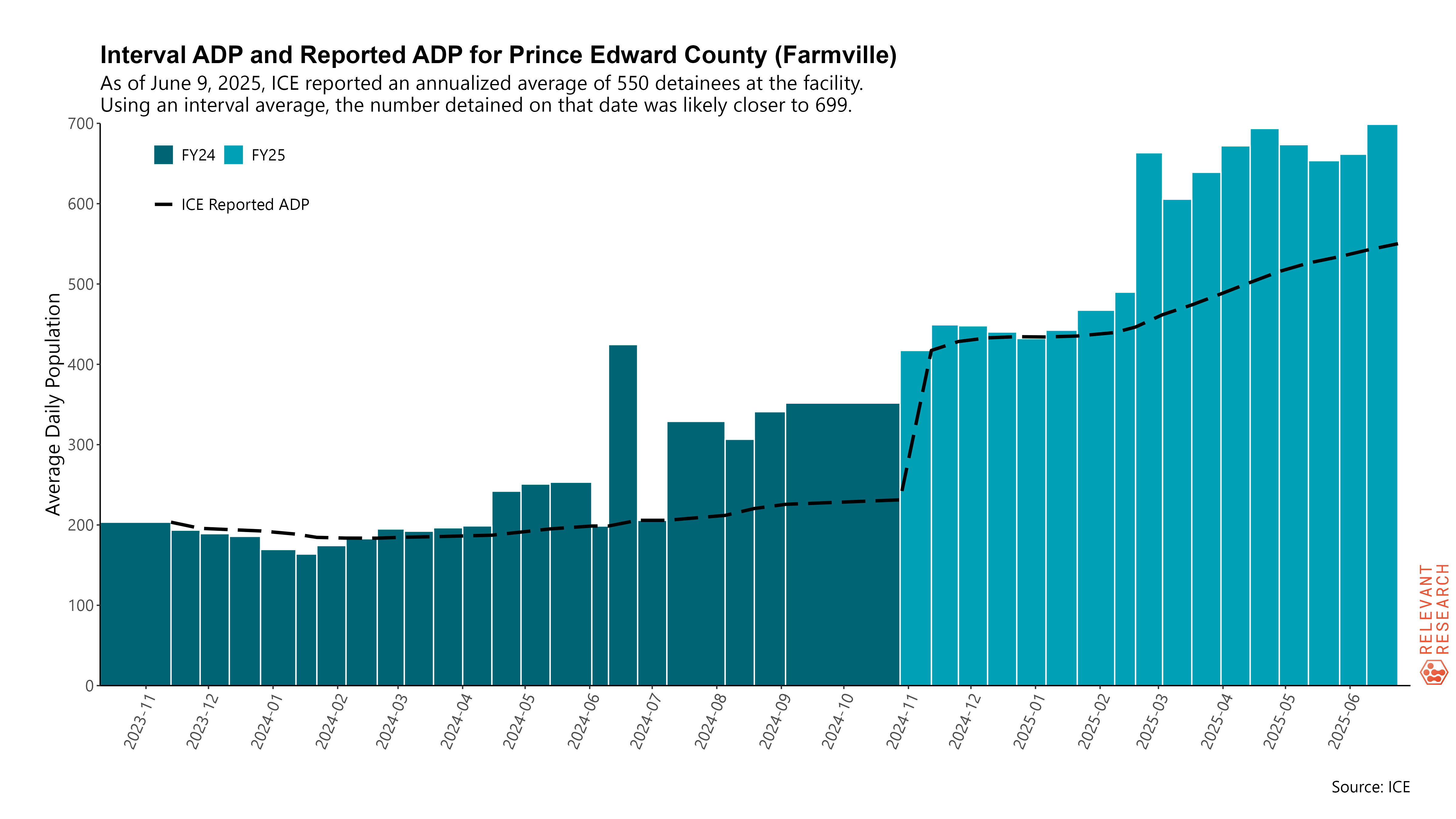
Prince Edward County in central Virginia has seen a substantial spike in its detained population, maybe as a result of increase arrests around Washington, D.C.—although other explanations are possible.
Finally, to illustrate instances when ICE is over-reporting for some facilities, we include the example of El Valle Detention Facility near the border in the Rio Grande Valley in Texas. In this case, Interval ADP is lower than what ICE is reporting—possibly as a result of fewer people coming across the border.

Please find the full package of 164 Interval ADP charts in a zip file below. This includes all ICE facilities currently in use. The file is an estimated 47 MB. (If the download link breaks for some reason, please let us know.)
Please also find an interactive table of current ICE facilities below. If any facility shown an Interval ADP of “NA”, because it is new to the detention spreadsheet and, therefore, there was no previous number available to calculate Interval ADP. Since the data are taken directly from ICE’s spreadsheets, attribute any misspellings to the agency.
If you notice anything unusual, have questions about the data, or would like to share additional information with us, please don’t hesitate to reach out. We are eager to learn more from people who are on-the-ground across the country.
As long as you cite this post and attribute the work to Adam Sawyer and Austin Kocher, feel free to use these graphs and the data table without seeking additional permission.
Support public scholarship.
This newsletter is only possible because of your support. If you believe in keeping this work free and open to the public, consider becoming a paid subscriber. You can read more about the mission and focus of this newsletter and learn why, after three years, I finally decided to offer a paid option. If you already support this newsletter financially, thank you.

 | A guest post by
|