
Show Your Work: Visualizing the Deportation Data Problem
Your visual guide to understanding deportation data: why the numbers vary depending on what you count and why we should insist on methodological transparency.

Even as a fairly tech-forward person, my most valuable tools are often decidedly analog: a pad of giant graph paper, Post-it Notes littering my hallway wall, and whiteboards where I mind-map research projects before writing them up. Visual methods are powerful because they allow us to break free from linear, sequential thinking and see relationships between things—ideas, processes, data—from multiple angles at once. Beyond analysis, visual methods also help us create conceptual models, frameworks that clarify how different pieces of data within a system connect and interact. This is exactly what I want to share with you today.
Let me show you how this works in practice with a current challenge I’m wrestling with. Over the past week, I’ve been looking into DHS’s claim that it deported 622,000 people and trying to reverse-engineer that number given the lack of transparency surrounding DHS’s enforcement data. In my previous post and live discussion, I explained my skepticism about that number and outlined two key problems: the potential inaccuracy itself, and DHS’s troubling lack of transparency around enforcement data.
Although many immigration reporters and analysts have raised concerns about DHS’s purported deportation numbers, I don’t believe anyone else has tried to unpack, in writing, why these concerns exist and how we should think about DHS’s statistical claims. (If I’m wrong, please point me to those sources.) The reason for this gap is likely that the analysis is genuinely complex—requiring deep dives into definitional questions and multiple, often contradictory data sources. That’s why it’s taken me this long to write about it, at least. Counting “deportations” turns out to be far more complicated than it appears, and the definition matters enormously.
Can we use visual thinking to make this complexity more accessible and raise the quality of the conversation for everyone, regardless of political perspective? That’s the question I’ve been asking myself this week, and I think I’ve found an approach that helps. While trying to make sense of DHS’s enforcement numbers, I created a simple diagram that clarified the relationships between different data points. I’ve made countless diagrams like this over the years for my own understanding, but this one felt worth sharing. It might help you navigate this messy data, too.
Visualizing DHS Enforcement Data
The figure below started on a whiteboard, then I digitized it in Miro, a mind-mapping program I use with my team. The diagram illustrates the nested relationship between the various legal and analytical categories that the Office of Homeland Security Statistics (OHSS) uses to classify deportation-related actions, categories I explained in my previous post. I’m using FY 2024 data because that’s the most recent complete year OHSS has published. This is a first draft and I welcome feedback for refinements, but it should give us a solid foundation for understanding how these numbers fit together.
Here’s the diagram I’m working with. Don’t rush past it. I know it looks dense at first glance, but it’s worth sitting with for a minute. Start with the outermost box and work your way inward, noticing how each category of enforcement actions nests within the next. Take time to understand these relationships. Once you've grasped how the categories fit together, look at the bottom section, which reveals the key insight: the number of “deportations” changes dramatically depending on which categories you include in your count.
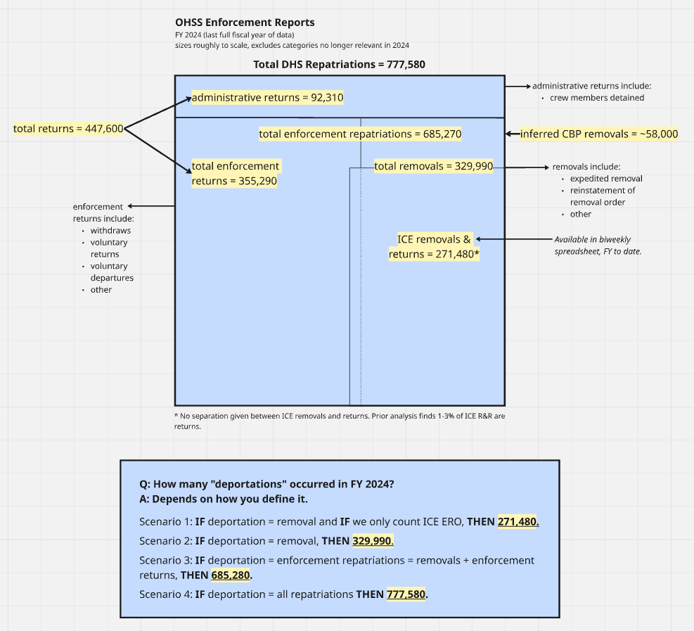
As I said in my previous post, the term “deportation” can be interpreted more than one way because it no longer has the precise legal meaning it once did. The figure above helps us grapple with key points of contention around how people are using this term and what they’re counting. I typically use “deportation” as a synonym for removals. However, this definition is clearly in competition with how others are using it: as a synonym for enforcement repatriations, meaning removals plus enforcement returns.
While there’s no authoritative source that says you can or can’t use the term this way, I want to illustrate one central problem with it. Enforcement returns is a really large number out of total DHS repatriations. Although it does usefully capture people who are forced to leave the country even without a removal order, it also includes—by virtue of that broad definition—a large number of people who are simply withdrawing their request to enter the country or returning voluntarily. In my view, that's an extremely different situation from someone who has been living in the country for 20 years, has a removal order, was arrested and detained by ICE, and then deported (i.e., removed). I understand why trying to capture the full universe of enforcement-related actions under the umbrella of “deportations” helps us see a bigger picture. But referring to all of those lumped together as deportations includes too much real-world diversity—vastly different situations—and I think it’s somewhat misleading given that a very large number of those people do not have removal or deportation orders.
In any case, one also has to be consistent retrospectively, counting the same thing over time historically so you can do an apples-to-apples comparison. But this raises a second major issue.
Because the total number of enforcement returns includes many people at the border, any administration that heavily militarizes the border and shuts down cross-border traffic—whether you interpret that as getting the border under control or cutting off pathways for humanitarian migration—will see fewer people entering the processes that contribute to high enforcement returns. This actually produces a decrease in the overall number of “deportations” if that's how you’re counting them. And I think that’s the situation the Trump administration is in now. There’s much more interior enforcement, most of which will be actual removals, and there’s a dramatic decrease in arrests and various forms of parole and asylum access at the border, so those numbers are way down.
If you count deportations as total enforcement repatriations, we have to ask whether the increase in enforcement repatriations from the interior—actual legal removals—is enough to compensate for the decrease in enforcement repatriations from the border. Under these circumstances, it’s very likely that the Trump administration is actually deporting fewer people overall than previous administrations, even though they’re substantially increasing the number of interior deportations.
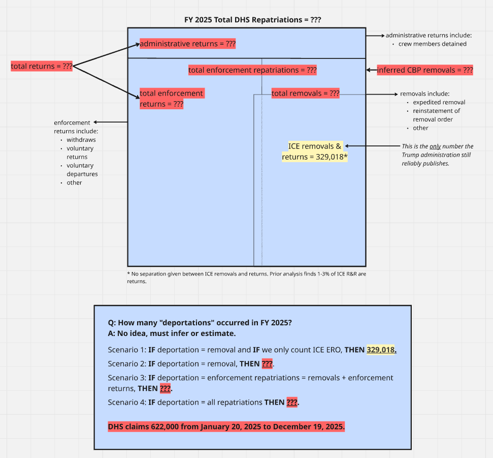
Now let’s use this framework to understand what data we actually have for fiscal year 2025 and now, fiscal year 2026.
The diagram below uses the same structure as the one above, but I’ve blocked out all the categories where we currently lack data. What remains visible is stark: we have essentially one single number—ICE ERO removals. In a way, this helps us visualize the problem we face now that OHSS has stopped producing monthly enforcement reports. This is how little information we have to go on. To be clear, there are other data sources published by Customs and Border Protection that may help us fill in some of these gaps, either directly or inferentially. But the contrast between what we used to know and what we know now is dramatic.
New York Times Deportation Estimates
Out of sheer coincidence (and entirely unbeknownst to me until someone informed me on Sunday), I published my detailed analysis of the Trump administration’s claims on the same day that the New York Times also published an article titled “How Many People Has Trump Deported So Far?” that sought to accomplish roughly the same goal. I don’t love the article.
The article reports that from January 2025 to January 2026, the Trump administration completed 540,000 deportations (which it defines as enforcement repatriations), and that interior deportations totaled 230,000. These may be reasonable estimates, but the data sources and methods used to reach these numbers are left mostly to the imagination. The article states it used “available public data” but doesn’t always specify which data sources or how they were combined to produce these figures.
I think the article was intended, admirably, to provide as simple and straightforward of an answer as possible. Yet there’s very little hedging or uncertainty, just numbers presented as fact that readers will inevitably treat as authoritative because they come from The New York Times. Again, it’s entirely likely the article is a really clever integration of available data in a way I hadn’t thought of. But my initial reaction when reading (and re-reading) it was, how are they coming up with these numbers? and why are they defining things this way? and not feeling like I was getting a clear answer. Normally, this is the kind of article that I would read with great enthusiasm. But this time, I had to spend way too much effort trying to make sense of it.
For example, the article glosses over definitional questions in ways that actually create more confusion. I’ve already discussed my concerns about using “deportation” as a synonym for enforcement repatriations, but the article compounds this by referring to administrative returns specifically as “repatriations”—a simple mistake, since OHSS uses “repatriations” as an umbrella term for all of these categories. Using “repatriations” to mean something very specific when it actually means something much more general is an attempt to simplify that backfires, making things more confusing rather than less.
I’ve been pulling together the various data sources that might fill in these gaps, just as The New York Times did, and using the diagram above to help organize empirical or inferred data. I’m genuinely interested in reproducing their analysis, because the data team over there does interesting and generally good work. If I can make the math work and match their numbers, I’ll provide a detailed breakdown of how they got there. If I arrive at different numbers, I'll show exactly how I got to mine. I realize The New York Times isn’t an academic publication, and maybe I value methodological transparency more than most people. But I don't think it helps to report a specific number with great confidence as if it were established fact without providing the receipts for how you got there.
Show. Your. Work.
That’s the most important larger point of all of this. When you’re dealing with data that can be analyzed and interpreted in different ways, transparency about your methods becomes more important, not less. This matters whether you’re a news outlet or a government agency. This is especially crucial when we’re talking about possibly the most important and controversial statistical claim of the second Trump administration. Without methodological transparency, we can’t evaluate competing claims, can’t build on each other’s work, and can’t hold either journalists or government officials accountable for the numbers they report.
That’s exactly what I’ve tried to do here with these diagrams. By visualizing how different enforcement categories nest within each other, and by showing which data we have and which we lack, I’m not just making an argument about deportation numbers. I’m showing you how I arrived at my conclusions and empowering you to make sense of things for yourself rather than simply trust me. You can disagree with my definitions or my methods, but at least you can see them, you can build on them, critique them, point out where I made mistakes or errors in judgement, or you can use them as a starting point for your own analysis.
This is what we should demand from everyone making claims about deportation statistics, whether it’s DHS announcing record numbers, The New York Times reporting estimates, or researchers like me trying to make sense of it all. This means being explicit about your calculations, clear about your definitions, transparent about your data sources, and willing to show the path from raw data to final numbers.
In the coming weeks, I’ll continue working through the available data sources to see if I can reverse-engineer the various numbers being reported. I’ll share what I find, how I found it, and where the uncertainties remain. Because in a moment when immigration enforcement is so polarizing, we need to insist on clarity, precision, and transparency. Those are principles that everyone should get behind regardless of your politics.
The work continues. Stay tuned.
Support Public Scholarship
This newsletter is only possible because of your support. If you believe in keeping this work free and open to the public, join the 100% of surveyed paid subscribers who said this newsletter is a good steward of their investment. You can read more about the mission and focus of this newsletter and learn why, after three years, I finally decided to offer a paid option.

I look at the regime’s removal numbers with a jaundiced eye. In our house, one of our favorite sayings is, “I call bullshit.”
The visual contrast of the missing data sources across the two versions of the diagram was very helpful, thank you!