Survey Says: Axios and No Labels Fail at Data Ethics
For politicians attempting to justify controversial positions, the phrase “the American people” as a justification has become as ubiquitous as it is devoid of a specific referent. But to give the illusion of an objective constituency with specific wants and needs, a cottage industry of survey companies and organizations that provide on-demand polling tailored to their clients’ (or their agendas’) preferred outcomes.
And so, more than half a century after the book How To Lie With Statistics was published, we still see charts and graphs that skew data badly enough to raise ethical questions about their underlying integrity.
One blatant example of this comes from Axios yesterday morning, which cited a survey from a group called No Labels. Axios uncritically recites the claim from No Labels that Joe Manchin supporters prefer a pause on government spending. The headline reads “Exclusive poll: Americans favor Manchin’s ‘strategic pause’”.
I’m not here to comment on what Joe Manchin’s supporters think or what he thinks about government spending. What I want to draw attention to is the leading graphic from the report. It is an excellent (by which I mean terrible) example of what I would argue is both very skewed polling questions and also unethical data visualization.

To begin with, survey questions typically use parallel structure in order to get reliable responses. The wording of two or more questions should be similar with minor, strategic differences so as to clarify the results of the data. For example, a survey might prompt respondents to choose either “we need large scale welfare spending now” versus “we need large scale welfare spending later.”
Instead, the No Labels survey above contrasts one statement that says we “need welfare spending now,” with the second statement, we “favor a strategic pause to understand the implications of the $3.5 trillion.” The statements are structured entirely differently, and the second has entirely new information that’s not even present in the first question. Moreover, while the first prompt is short and curt, the second prompt includes qualifiers most respondents are going to gravitate towards regardless of content. In short, I don’t think it’s plausible to view this particular polling question as a result of an objective inquiry. The fact that the results are even close in some categories despite the significant bias of the questions is a remarkable finding in itself.
Now let’s look at the graph itself. The graph on the left and the graph on the right in this image use completely different scales for no justifiable reason.
Consider the responses to the second question from urban respondents. Due to the distortion in the graph, it would appear that the 47% of urban respondents that supported the statement on the right is actually larger than the 53% of urban respondents that supported the statement on the left.
One might argue that the graph on the right needed to be longer because the prompt above it is longer. But that of course raises two questions. Why are the two questions so different in length even though they report to be binary (see above)? And, why not simply adjust the formatting to present a more objective view?
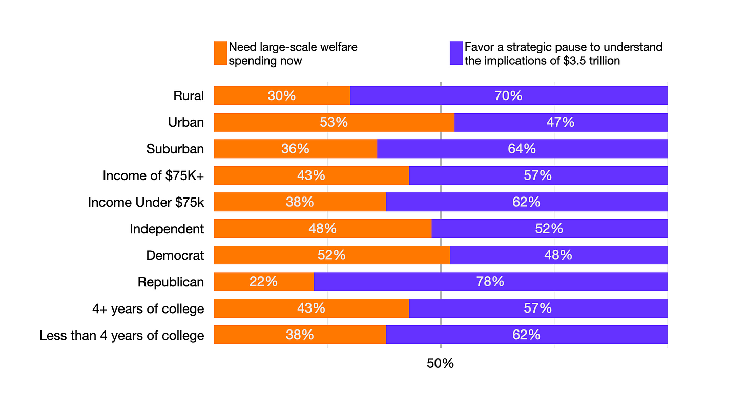
We have a few options for correcting this error. The first would be to ensure that the scale on the left and the right are proportionate, which is what Axios eventually did in Figure 3.
But there are two other options. We could use a 100% stacked bar chart (see Figure 4), which more accurately reflects the breakdown of a binary choice.
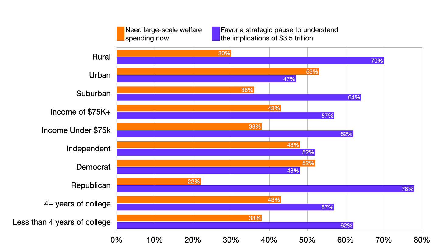
Or we could choose the more cluttered side-by-side bar chart (see figure 5), which adds complexity but at least allows readers to directly compare the responses of various social groups each prompt. I might use this one for analysis, but probably not for publication.
Given how easy it is to correct these errors, and how basic the errors are in the first place, I can’t help but wonder if there’s more behind the scenes than just a simple mistake. When I first saw these graphs, I was highly skeptical of the intent and the competence of the authors of that original graphic. And this is the problem with playing politics with data: by chasing headlines and offering to serve up survey results to fit an expedient political position, graphs like this one take advantage of the public's trust in data and further erode the integrity of news organizations.
By the end of the day, Axios attempted to correct the second mistake, the distortion of the left and right graphs. This, however, does not address the first concern, namely the use of highly skewed prompts. Nor does it address the fact that by the end of the day, I learned that Axios had plenty of warning about treating data from No Labels as objective, since Axios itself scooped the story about No Labels to spend money running political ads against the $3.5T bill in an article published on August 19. All in all, this is an excellent example of why statistical literacy is so important.


