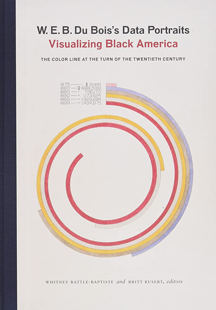
W.E.B. Du Bois Created These Infographics About Black America for the World's Fair in Paris 1900
If you like these data visualization, you can see them on display at the Cooper Hewitt Museum in New York City or get the book Visualizing Black America.
The Cooper Hewitt Museum in New York City is currently hosting an exhibit titled “Deconstructing Power: W. E. B. Du Bois at the 1900 World’s Fair” that showcases the way-ahead-of-its-time infographic designs of W.E.B. Du Bois.
As Hua Hsu notes in his essay about these graphics for the New Yorker, these graphics still strike most of us today as entirely modern even though they were drawn by hand 125 years ago by sociology students working with Du Bois in Atlanta. The graphics represent data on Black Americans in the late 1800s using creative and impactful choices in design, color, shape, space, and typography that have largely stood the test of time and inspired generations of designers.
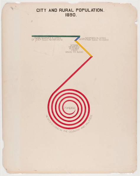
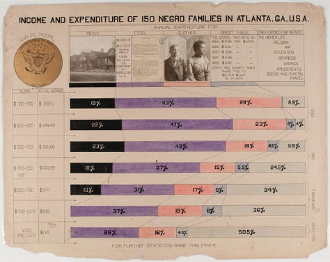
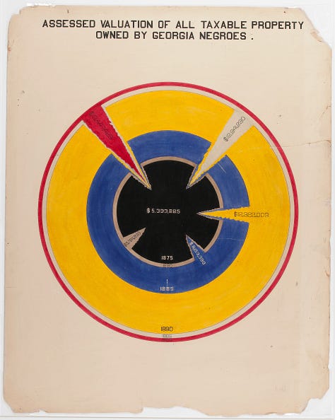
Edit: After I published this post, I saw that Mark Igra (@MarkIgra.social.sciences) noted on Mastodon that these images are available in the public domain on the Library of Congress and Public Domain Review. Thanks, Mark!
W.E.B. Du Bois was a prolific and influential public intellectual from the late 1800s through the mid-1900s. He is impossible to summarize adequately: the first African American to earn a PhD at Harvard University, a seminal figure in several generations of civil rights movements, and author of books such as Black Reconstruction, which features a discussion of what Du Bois refers to as “abolition democracy” and which has seen a considerable resurgence among scholars in recent years and shaped the abolitionist movement in the US and around the world.
On a personal note, I first read Du Bois and first encountered these graphics in my undergraduate years at Ohio State where I took several courses, including a history track, on African American and African history. I can’t recommend courses in Black and African studies enough. They were among the very best courses I ever took in college, and I feel strongly that efforts to cancel courses like these are doing an enormous disservice to students of all racial backgrounds. These graphics are just one example of the rich legacy of African American scholarship.
The historical context for these data visualizations is important to unpack. Jason Forrest, director of the Data Visualization Lab for McKinsey and Company and the editor-in-chief of Nightingale: The Journal of the Data Visualization Society, wrote a series of essays on Du Bois’s data visualization available on Medium. Forrest’s rich and readable essays explore the context for these graphics, specifically the fact that they were prepared for the Exhibit of American Negroes at the World’s Fair in Paris in 1900.
I found Forrest’s essay on “data journalism and the negro problem” particularly enlightening for how he examines Du Bois’s and his collaborator’s very intentional and strategic use of visual representations to make an impact on an almost entirely white audience.
If you can’t see the exhibit in person, Du Bois’s visualizations are also available in a book published just a few years ago entitled “Visualizing Black America.”
A note about the Cooper Hewitt Museum. I recently wrote about the National Building Museum, one of my favorite museums in Washington, D.C., which is currently home to an exhibit on the architectures of the US-Mexico border. (Read more about that here.) Cooper Hewitt has much of the same flavor as the National Building Museum with an emphasis on design, but it’s located in New York City in the Andrew Carnegie Mansion on Fifth Avenue.
In fact, last time I was there, Cooper Hewitt was then also hosting an exhibit on borders that featured, among other things, a video game called “Papers Please” which illustrated the largely arbitrary decision-making that happens at border checkpoints and prints of Ronald Rael’s seminal Borderwall as Architecture: A Manifesto for the U.S.-Mexico Boundary.
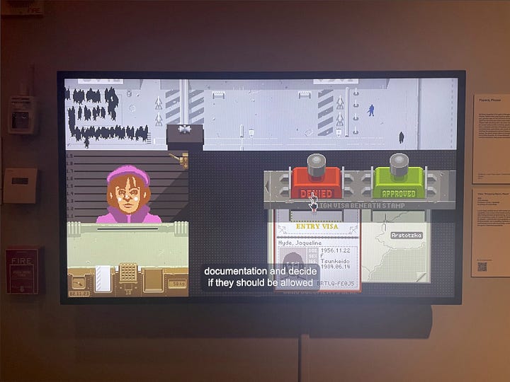
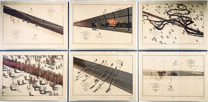
If you’re in New York City any time soon, a trip to the Cooper Hewitt is worth it, and getting to see the original prints of Du Bois’s data visualizations is truly a once-in-a-lifetime opportunity.
PS: If you like this post, you’ll love reading about Florence Nightingale, a woman in the 1800s who also played an influential role in shaping data visualization and only recently has started to get recognition. To learn more, start with this article in Scientific American here.
Support public scholarship.
Thank you for reading. If you would like to support public scholarship and receive this newsletter in your inbox, click below to subscribe for free. And if you find this information useful, consider sharing it online or with friends and colleagues. I maintain a barebones site at austinkocher.com and I share immigration data, news, and research on Mastodon (@austinkocher), Twitter (@ackocher), and Instagram (@austinkocher). You can see my scholarly work on Google Scholar here.


